Web design is a notoriously tricky subject. Often we give up any thoughts of innovation when the process of realising them is such hard work. Part two of this WordPress dissection continues to try and explain the basic workings of the software, how this relates to the layout, and how anyone can personalise their blog.
The focus will be on finalising the basic layout from part one, and then finishing the header and footer sections. Both of these are important as they stylistically define a blog and act as visual focal points – do it well and people will want to read your blog, do it badly and they may not even bother.
Web designs
Websites are consistently at the mercy of numerous difficulties. They must be able to present information to people who run different software, on different platforms, in different languages, and with different levels of visual awareness.
In the early days of the web this was relatively easy. People did not expect much and were impressed just by the availability of a website. Layouts were chunky and appeared to be created by programmers. Most of them were.
Today the emphasis is on making a attractive site that is elegant and clean and works transparently of the content. WordPress has, to a large extent, achieved just that, and makes full use of the latest design methodologies. It is therefore important that any WordPress theme discussion attempts to retain this ‘standards conforming’ philosophy.
Accessibility and Google friends
Accessibility is a term used to describe the process of making a website accessible to those who may be viewing it on something other than a high resolution monitor, or who may even be visually impaired.
A key issue here relates to font size. We don’t want to design a theme with an impossibly small font, and neither do we want to prevent the chosen font being re-sized to suit personal preference.
A secondary issue regards Google. Most of us want our content to appear in Google’s pages, and there are a lot of things we can do to improve its ranking. One of the simplest is simply arranging our page such that content is delivered before menus and other non-content. Why? It seems that Google gives preference to data at the front of an HTML page.
Putting the content first also makes the website a better experience for non-graphical users. There are not many of these, but there are some.
Captain, we have a problem
So what does this have to do with the second part of the guide? My original plan was to cover the header, footer, and sidebar here, and finish the series with the content. Thirty minutes into writing part two and I realised my previous design was far from complete, and that it was going to take time to explain why.
Fortunately the problem was not a big one. In fact, I could easily have explained it as a design decision and skipped straight ahead. Instead, let’s look at what I previously proposed:
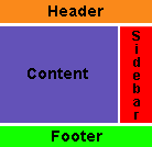
This is a standard website design and worked perfectly until the content section became taller than the sidebar. This had a strange effect:
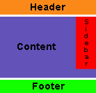
The content has wrapped around the sidebar! In itself this is not a big issue and is easily fixed, but it became apparent how unfinished the previous design was. It’s time to make amends.
Some statistics
Before we do that, I want to show some statistics from my own website.
| Mozilla Firefox | 43% |
|---|---|
| IE6 | 43% |
| Apple Safari | 6% |
| Opera | 3% |
| Others | 5% |
Taking into consideration that WordPress attracts more non-IE users, it’s obvious that we must cater for many different browsers on several platforms.
Options
Variations on a common theme will be presented as options. These will change appearance or add extra functionality to the theme, and the intention is to cover a wider range of ideas without forcing a particular style.
An option will be presented as follows:
 Option 1 – Some description
[…] th, 2005
UrbanGiraffe » Dissection of a WordPress Theme: Part 1 UrbanGiraffe » Dissection of a WordPress theme: Part 2 í•´ ë³¼ ìƒê°ì´ë‹¤.
[…]
Excellent tutorial. I’m a new-b to css and I’m finding this very educational and easy to follow. Thank you for putting it together. I’m looking forwar to part 3!
Your part I link doesn’t seem to be working any more, which is a shame. Can you repost it or put it somewhere else? I’ve been devouring Part II, but I think it would make more sense if I’d read Part I first.
The broken link is now back in action.
[…] em with minimal effort, and with a little luck you can be blogging in under half an hour. UrbanGiraffe >> Dissection of a WordPress theme: Part 2 Web […]
[…] affe has posted some excellent information on the dissection of a WordPress theme: part 1, part 2.
Permalink
[…]
I recently started tinkering with WordPress, and was a little puzzled with how the pages were constructed and laid out. The first two parts of the tutorial have taught me a little about how to use themes to customize the blog’s appearance.
I look forward to reading the rest of the tutorial, and learning how to fully customize WordPress’ appearance.
Keep it coming!
Good effort, looking forward to seeing the rest.
One comment/suggestion it would be good to see this as one web page, including the code, to make it easier to follow.
So far I have not seen an updated tutorial on the WordPress Wiki for 1.5 themes.Perhaps you could consider posting there? With some more background info on the WordPress 1.5 theme structure (perhaps added by WordPress developers) this would could become a valuable resource.
[…] p://isice.twbbs.org/blog/Isice_wp/wikiwiki.php?page=WordPress”>WordPress theme: Part 1 Dissection of a WordPr […]
[…] wo articles he has written so far: http://www.urbangiraffe.com/2005/04/12/themeguide1/ http://www.urbangiraffe.com/2005/04/22/themeguide2/ Once my exams are over I will begin wo […]
I have got to say your two articles on the “Dissection of a WordPress Theme” are very nice and look forward to reading your next two. This will help me greatly when I am ready to work on a new theme for my blog.
I made a post over at my blog about your posts. Keep up the good work.
Your’s is the best tutorial/explanation that I have found on this topic. Thank you very much for creating this. Could this be posted to the Codex, too? I think it could help legions of people. Terrific job!
Of all the work I done on my site, I can’t seem to get it right.
When I go between certain pages, I can tell my site CSS is not fluid enough. However, I can not find where I have to edit to make it all the same.
If anyone can contact me, I would like that alot. 🙂
I have attempted to put together a Visual Anatomy of a WP theme. Just to understand how the templates work together…
[…] Theme : tutorials
Dissection of a WordPress Theme: Part 1 urbangiraffe.com Dissection of a WordPress Theme: Part 2 WordPress is not PHP How To Blog By Email With W […]
[…]
UrbanGiraffe continues to expand on its WordPress theme dissection. See parts 1, 2, 3 and 4.
Permalink
[…]
Dissection of a WordPress theme: Part 2
Dissection of a WordPr…
What happened to the links where we can download the images you used in the examples? I can’t find them anymore. Did they disappear with the redesign?
They’re still there, only the links disappeared and recent troubles have put me behind on fixing things. You can get direct access to them via http://www.urbangiraffe.com/wp-content/html/themeguide/part1/MonkeyMagic1.zip (and MonkeyMagic2.zip)
Also, http://www.urbangiraffe.com/wp-content/html/themeguide/part2/MonkeyMagic_theme1.zip (change ‘part2’ to ‘part3’ and ‘part4’ as appropriate, and MonkeyMagic_theme2.zip and MonkeyMagic_theme3.zip exists in parts 2-4)
I’m having trouble with the margin part I added in 85% and it’s not working :\ It just sits there.
Lacus: I took a quick look at your website and noticed one problem – the
divwith idwrapperlooks like this:<div id=“wrapper”>When it should look like:
<div id="wrapper">Although they look identical, the first one has fancy quotes, while the second has straight quotes – an unfortunate side effect of WordPress manipulating with my article I believe. As such, the browser doesn’t understand the ID, and so doesnt apply the 85% to the wrapper. This is easily fixed by deleting the smart quotes and inserting normal ones.
Awesome it works! Thank you very much for helping me. 🙂
[…] s tutorial by Urban Giraffe. Dissection of a WordPress theme: Part 1 Pulling it apart Dissection of a WordPress theme: Part 2 Complete design, header, and footer Dissection of a […]
I have been following this guide closely and have run into an unexpected problem, the theme isn’t rendering properly in IE. I’m currently in the process of retracing my steps, any idea where I went wrong?
I took a look at your website and spotted a few problems in the CSS. There are several occurences of a question mark in bad places:
font-family: �Verdana', Arial, Trebuchet MS, Sans-Serif;I think that IE must get confused about these, but Firefox ignores them!
[…] the inner workings of wordpress. Cheers to John Godley. Part one – Pulling it apart Part two – Complete design, header and footer Part three – The sidebar Part four – The cont […]
Okay, I’ve answered the two questions I asked in Part I.
Now, though, my content is overlapping my left border. I think it might be something overriding the wrapper code. But I’m not sure what to fix. If you can help I’d appreciate it!
I think the problem is similar to this one – the ID for the wrapper element is not being found because the quotes are different.
Duh! I should have caught that. Thanks!
Of course now I have to figure out why the sidebar has different margins than the content. And how to make the whole wrapper be towards the left, but still clearing the border image…
I also wonder why the margins are defined twice — once in #wrapper, once in div>#wrapper.
And by the way, I like Czech food. Especially gulas with potato or bread dumplings. Mmmm.
Wish I could edit my comments instead of leaving three in a row — sorry!
I understand why the margins are defined twice.
I’ve made a lot of progress styling my new variable-width blog, using this “wrapper” code and a lot of other ideas from your guides. It works nicely in Firefox.
In IE, when I resize the window smaller, the content gets smaller up to a point, but the text and headings continue to resize even smaller. Why is that?
And is it possible to use something like this wrapper code to assign the sidebar and content their own minimum widths, along with a wrapper minimum, or would it be better to either set minima for the content and sidebar OR the wrapper?
Hi Marcy. The resizing keeps on going in IE because it doesn’t understand the minimum and maximum CSS settings. You have the choice of either letting the user resize to their hearts content (most websites do this), or using some JavaScript to force IE to behave a little better. You can find details of the Javascript solution elsewhere in the guide.
You can give minimum widths to any page element, although I don’t know what effect you will have by giving just the sidebar a minimum. I would imagine you will be better off with a whole-page minimum.
Thanks John —
I’ll give up on the resizing thing; I don’t want to bother with JavaScript.
No wonder most people go with fixed-widths… styling variable width is really hard. I thought I could center my header and footer in relation to the content by putting them inside the wrapper, but that messed things up in IE and had no effect in Firefox. Sigh. I give up, for today anyway.
[…] shed soon. For a decent guide to customising the default WordPress the check out Part1 and Part2 of UrbanGiraffe’s guides This entr […]
Hello John, Could I bother you with a question? I am following along in your theme dissection example. At the point where the padding and margin are both set to 0, your test shows the elements of the pages squished together. Mine doesn’t. I’ve gone through it and through it (style.css and index.php) and I can’t find where I have gone wrong. Can you look at it? Thank you VERY much!
Hi Stacey. There’s nothing to worry about, your blog is correct. By ‘squashed together’ I meant that all the padding between the elements has been removed. The header is still at the top, the content still on the left, and the sidebar still on the right. The picture just shows this when the browser has been shrunk to a very small size – I didn’t want to include a big picture that was mostly white space!
Hi John, thanks for the great tutorial!
Maybe I just missed something, but do you know why the 70%/28% widths for the content/sidebar ids need to be *exactly* 70/28? If I change them to anything else – 70/27, 72/31, etc – IE doesn’t do the floating correctly; the sidebar drops down to below the content. Why are these the magic numbers?
I’m trying to get a little padding around the sidebar content. When I tried adding a “padding” style, it also broke the float. What am I doing wrong?
thank you! Michelle
Hi Michelle,
They don’t need to be exactly 70/28 – those are just numbers I chose to give a nice ratio. The numbers must never add up to more than 100%, so you can’t use 72/31. As for the sidebar problems in IE, the likely cause is a combination of margins, padding, and widths that is adding up to more than 100% and causing the sidebar to be ‘pushed’ down where there is more space. It’s hard to say exactly why it’s working in your instance without seeing what you are doing – do you have it on the internet?
I too benefited from your tutorial. I was not a css newbie though I was new to WordPress and PHP. I got everything to work eventually, however one day my Mac broke. I viewed my blog on a windows machine using IE and noticed I had the sidebar problem. I and others have looked at it and I’ve fiddled with the margins and paddings a pile, but I’ve never found the right combo.
I’ve even put borders around it, there is pile of space between the sidebar and content. I’ve changed things a lot, including put the WordPress stuff inside my overall website look/css/html. I was told it viewd fine in IE 6 by people over at WordPress.org support forum. I added an author photo at Jakob Nielsen’s insistance and I noticed it wasn’t showing up in IE… I commented it out, but that didn’t fix my margin problem.
Since you’ve taken a look at some other people’s issues, perhaps you should could have a look at mine. It is live and I’m leaving in the colored borders if that helps you any…
blog.muschamp.ca
Thanks,
Muskie
[…] Dissection of a WordPress theme: Part 2 […]
Urban Giraffe,
Thank you so much for your help in explaining how this works. The tutorial approach, one step at a time, is so helpful.
Just wanted to let you know that I appreciate your help.
Great tutorial. I started redesigning my site from scratch and have run into a bit of trouble… my wrapper isn’t working! I have no idea why. At the moment, it looks like this: http://www.legendhouse.com/index.php
sorry… I guess I should’ve mentioned that it’s close to working on Firefox, but not remotely close in IE. Any insights?
Hi John,
Clearly I’ve gone awry (since nobody else has commented the problem).
I now have the content below the sidebar. Sigh…
Can you take a look at the testing site? http://ia.polimom.com
Clearly time for more coffee. Reloaded and fine. Disregard…. sorry…
Phillip: I managed to get your sidebar working correctly in IE by adding ‘float: right;’ to the CSS style for #sidebar
[…] but…since i am still having my procrastination therapy i decided to have major construction with the theme the one i am using now is Triplet Identification Band nothing problematic but i just don’t like the way that i am actually using someone’s work so…i need my OWN theme after google-ing for a while i found this “Dissection of a WordPress theme” by UrbanGiraffe there are 3 parts: one, two, and three they have wordpress plugins and themes too. oh well…let’s see if i can make my own now. […]
My content is below my sidebar after implementing the changes in Part 2 Step 1 – any ideas?
Nevermind – it fixed when I added the additional DIV tag in Part 2 Step 2
[…] UrbanGiraffe Here we make use of some pretty complicated CSS code that enables us to stop Internet Explorer pushing the sidebar away, and also causes Firefox to react better at smaller widths. To do this we employ the CSS concept of minimum width. As you would expect this allows us to define a minimum width for an element. When the browser goes below this width it stops sizing the element and puts scrollbars on the window. This is completely acceptable. There is one catch to this wonderful concept: Internet Explorer does not support minimum widths. Fortunately we can work around this by using dynamic properties. This is a way to embed JavaScript within the CSS. Not particularly pleasant, and it requires JavaScript to be enabled. Our aim is to introduce some styles such that: Minimum width supporting browsers have a fluid layout and a fixed minimum Internet Explorer has a fluid layout and fixed minimum when JavaScript is enabled Internet Explorer has a fixed layout when JavaScript is not enabled We can achieve all of this neatly by changing the wrapper style: […]
Just want to say that you are awesome and have helped me a lot!
Maybe its because I am all very new to these but I lost track at this point… I cant understand where to “add”
#content{
width: 70%;
float: left;
}
Is it somewhere in the
index.php? Also where exactly will I do the sidebar change?Thanks in advance
Cenk
Before your guides, I was at a loss. Kubrick is not me at all… your guide was (is!) easy to follow. Your options are wonderful. Thank you so much!
Cenk: All CSS styles go in ‘style.css’. The sidebar code lives in ‘sidebar.php’
I noticed a little typo mistake in your CSS file;
You wrote :
div>#wrapper ->is has to be:div.#wrapperNow the text aligns in the center 😉
btw, great tutorial!
Thnx
Hi John, thanks for the tutorials. It clarifies lots of doubts that I had on layout design.
Along your tutorial I modified the codes so that I can have a fixed width sidebar at the right of the screen, and a fluid content width. In such a case, reader with 800×600 and 1026×800 will have the same sidebar size. I get want I want from the codes below, however, since I am fairly new in css and am not a web designer, I am not sure of the implication of the codes.
#sidebar{
float: right;
width: 190px;
}
#content
{
margin-right: 195px;
}
#wrapper
{
margin: 0 auto;
overflow: hidden;
}
What do you think? What is the unfavourable consequences of the above css?
I can’t see anything wrong with it here! If it’s any help, you might be interested in checking out A List Apart’s attempt at a fluid width design with fixed sidebars.
Very, very nice tutorial. Really like the “dissection” approach. I was knocking my head against the wall – not being able to getthe width issues (fluid v fixed) until I scrolled thru the comments and saw your reply re double quotes – works lie a charm now.
The like to your book looks interesting. Is it availalbe via Amazon?
Russ
Russ: It’s available via Lulu, a self-publishing print house.
James: You still have the Kubrick header code, which is affecting the CSS. Probably you haven’t uploaded header.php, which is why it looks different on your local machine and live server. Either way, remove the following from header.php:
<style type='text/css'><!--#header
{
background: url('http://www.jamesyardley.com/wordpress/wp-content/themes/bonsai/images/header-img.php ?upper=DDFFDD&lower=005500') no-repeat bottom center;
}
#headerimg h1 a, #headerimg h1 a:visited, #headerimg .description { color: #000000; }
--></style>
I downloaded my header.php directly from my server and here is what it looks like.
; charset=" />
» Blog Archive
" /> <!-- leave this for stats -->
" type="text/css" media="screen" />
RSS Feed" href="" />
" />
/">
i’m stumped!
Ok. I know it has something to do with the “functions.php” file. It seems as though that entire file is responsible for this styling. Am I supposed to just delete this file?
Yes. Somewhere in your theme will be the code that’s adding the header style. If you can find it and delete it then your theme should work as you expect
[…] Dissection of a WordPress theme: Part 1 Dissection of a WordPress theme: Part 2 Dissection of a WordPress theme: Part 3 Dissection of a WordPress theme: Part 4 […]
Just incase anyone else is encountering this the margin-left: 70%; tag wasn’t working for me with wp 2.0 so I removed it and put float: right; and it works fine now.
[…] UrbanGiraffe ” Dissection of a WordPress theme: Part 2 … of realising them is such hard work. Part two of this WordPress dissection continues to try and explain … Thirty minutes into writing part two and I realised my previous design … […]
Dear John,
Thank you so much for these tutorials!
I have 2 questions (at the moment):
1. At the end of part 2, the blog doesn’t center in the ie browser.
2. Does your book on LULU have the same or more or different information?
Thanks..Rosemary
[…] UrbanGiraffe ” Dissection of a WordPress theme: Part 2 Another way of sticking your neck out. Posted on April 22nd, 2005 in WordPress. Flexible wrapping. Currently we have a fluid design, with the contents and sidebar bundled together in a wrapper. […]
The book has different information. I basically took what I’ve written here and merged it all together to give a more coherent picture of the design process (writing it in parts lead to some duplication of information which a single guide removed).
[…] inonizer blog three » http://www.urbangiraffe.com/2005/04/22/themeguide2/feed @import url( http://www.information-page.com/blogs/inonizer-blog-three/wp-content/themes/green-marinee/style.css ); […]
[…] UrbanGiraffe Dissection of a WordPress theme: Part 2inonizer blog two UrbanGiraffe Dissection of a WordPress theme: Part 2 : Added on June 7th, 2006 at 5:59 pm; inonizer blog one UrbanGiraffe Dissection of a WordPress theme: […]
[…] UrbanGiraffe Dissection of a WordPress theme: Part 2inonizer blog two UrbanGiraffe Dissection of a WordPress theme: Part 2 : Added on June 7th, 2006 at 5:59 pm; inonizer blog one UrbanGiraffe Dissection of a WordPress theme: […]
[…] UrbanGiraffe Dissection of a WordPress theme: Part 2inonizer blog two UrbanGiraffe Dissection of a WordPress theme: Part 2 : Added on June 7th, 2006 at 5:59 pm; inonizer blog one UrbanGiraffe Dissection of a WordPress theme: […]
[…] UrbanGiraffe Dissection of a WordPress theme: Part 2inonizer blog two UrbanGiraffe Dissection of a WordPress theme: Part 2 : Added on June 7th, 2006 at 5:59 pm; inonizer blog one UrbanGiraffe Dissection of a WordPress theme: […]
Hi John, I love this site , its been really helpful, but i seem to have run into somewhat of a problem with my stylesheet. It doesn’t seem to apply to the blog for some reason . I have input all the settings, but as you can see it has no effect on the style of the page .
thanks .
david
Thanks for the tutorial, found it very easy to follow.
Buuut, there is one thing. My sidebar seems to be underneath the content. I thought the float action was supposed to avoid that?
I’ve gone through the tutorial three times now and ended up with the same result. I’m sorry if it’s an obvious thing I have forgotten to do, I am new with WordPress and I haven’t done any CSS for over a year.
Heeh. Please ignore my first post.
I’m still having some problems tho…the front page seems to be the only page working like it should. Once I click to about or anything the page looks very wacky. Aiai.
First let me say thanks for putting this together. Now to my issue. Every time I insert the following code into the style.css I get a script error in IE 6. I understand that you have setup the css so that if javascript is disabled that a fixed width will be used, but if javascript is disabled will it give an error? The page displays, but has the error message at the bottom of IE. Is there a way I can change the formating to see which section of the css is being implemented?
Thanks
Kevin
#wrapper{
margin: 0 auto;
width: 700px;
width:expression(document.body.clientWidth #wrapper
{
margin: 0 auto;
min-width: 400px;
width: 85%;
}
David: You have missed off the ‘footer’ style (if you’ve reached that part in the tutorial yet), which is why your theme is looking a bit unwell.
Cilie: Do you have a single.php and page.php in your theme directory?
Kevin: I’m not sure if some of your code got chopped off by WordPress (very likely!), but you are missing a couple of brackets there (if that is the code you have then that would be an error). With Javascript disabled IE should just ignore the inline expression. Does Firefox with the Firebug extension installed give any javascript errors?
Hi,
Im working through the book (which I purchased) and I am at the footer section. It seems that the colored background which is supposed to go under the text locates itself somewhere near the top of the page. I cut and pasted from the PDF of the book.
Any ideals?
Regards,
Alan
As a followup to the above question, I was using the latest Firefox browser. But when I viewed the same item in IE6, it appeared to be what was intended. Is there a workaround? Does this represent a buglet in Firefox?
Regards,
Alan
I wouldn’t say it’s a bug in Firefox, but more just an example of the differing ways browsers present things. Unfortunatley there are many occasions when you have to go through hoops just to get one browser to play nicely. There are differences between versions of Firefox, but that’s probably not the case here – it’s more likely either to be a typo in the CSS/HTML you’ve produced, or one in my guide. If your theme is available online then you can post a link here and I can take a look
You can download it here:
http://www.alanstancliff.com/giraffe/alans_hack_2.zip
Thanks Alan. I’ve had a look and it’s a common problem. Basically all the content of your page is being ‘floated’. This gives you the columns you want, but the side effect is that a floated element has no height with respect to the rest of the page. This means that your footer appears directly under the header, and the content floats on top of it. Fixing it is simple:
#footer{
clear: both;
}
This forces the floated elements to be used in calculating the height.
I don’t know, John,
Here’s what I did to that section in the style sheet:
#footer

{

        margin: 2em auto;

	text-align: center;

	width: 85%;

	height: 3em;

	color: #804A0F;

	padding-top: 10px;

	padding-bottom: 10px;

	background-color: #F6C760;

clear: both;

}
No luck. It seemed to have made no difference. Am I missing something?
Regards,
Alan
Are you sure you refreshed the page and are not using a cached version? Making that change on my test box brought the footer down to the bottom in Firefox. It’s possible Firefox is still showing you a cached version of the old page.
Hi John,
I hit the Firefox refresh button half a dozen times and still no change. Then I turned off Sammy (name of my computer) and this morning I turned him back on again. I went to the Firefox tools/options/cache menu and cleared the trash out. Then it displayed properly.
Contrary to my expectations, it also seems to have worked in IE7.
Thanks for maintaining this site and answering our questions.
Regards,
Alan
[…] So here it is, a week later, and I haven’t made much progress in my theme learning tutorial. I did start part 2 of Urban Giraffe’s theme tutorial, but I think I wore myself out before I could post about it. There are numerous steps involved in Part 2, many more than in Part 1. So I’ve broken part 2 into subparts, hence the number 2(a). Part 2(b) will come along later. I’m not complaining, tho’. The author has been very thorough, addressing many web design related issues that I’d never have thought of. Let me see if I can recap what I did last week. […]
Hey John,
Great tutorial so far, just wanted to let you know about a small typo (flotation, left(repeated)):
“We have removed the right floatation from the fixed width sidebar and replaced it with a variable width sidebar that is offset 70% from the left left.”
Thanks again this has been VERY helpful!