Changing the links
We’ve styled and coloured the main part of the sidebar, but our links are still using the default colours. Let’s change that with two styles:
#sidebar a {
  text-decoration: none;
  color: #4A2C00;
}

#sidebar a:hover {
  text-decoration: underline;
}
And the result is a standard colour scheme:
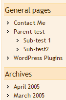
Search style
The search has not yet been changed and looks pretty ugly in the default state. A few styles and this is transformed.
#searchform {
  text-align: center;
}

#searchform input {
  border: 1px solid #4A2C00;
  background-color: #FDE5C3;
}

#searchform #s {
  width: 50%;
  background-color: white;
}
Now the search looks like this:

Calendar style
A final step, if the PHP code has been enabled, is to style the calendar. The calendar is a complicated element and is constructed using an HTML table. It requires substantial styling to get it looking just right.
#wp-calendar {
  border: 1px solid #FDE5C3;
  width: 80%;
  margin: 0 auto;
  text-align: center;
  margin-bottom: 15px;
}

#wp-calendar th {
  background-color: #FDE5C3;
}

#wp-calendar a {
  border: 1px solid #4A2C00;
  background-color: white;
  display: block;
}

#prev a, #next a {
  border: 0;
}

#wp-calendar caption {
  text-align: center;
  width: 100%;
}
These styles modify the table elements, adding a lot more space. The table headers th are given colour, and the days with posts are highlighted in white. A special style is made for the ‘next’ and ‘prev’ elements so they do not contain a border. This produces an output of:
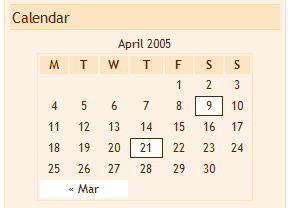
Putting it all together
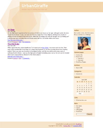
The sum total of this part of the guide has been to produce a final sidebar. It’s simple but concise, and there are many ways to change and enhance it further. Putting it in context of the themes from part 2 we get:
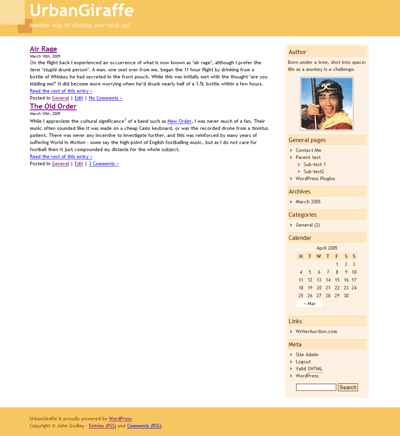
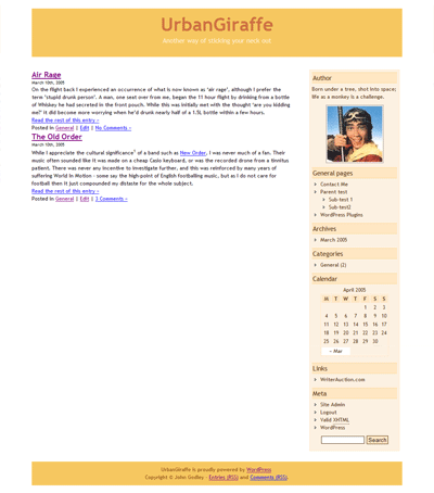
Conclusion
In this part of the guide we have completed the sidebar and produced something that fits in with the previous themes. Our focus has been on the WordPress PHP functionality and we have discovered that it is easy to add elements by making use of the WordPress Codex.
The next part will tackle the most important part of any blog: the content. After this the theme will be mostly finished, with a final guide bringing everything together.
Support
Please direct all support questions to the Theme and Templates support forum. Any support questions left on this page may not be answered.
[…] theme: Part 2 : 2005. 4. 22 추가. (ë”°ë¼í•´ ë³´ê³ ìžˆë‹¤. 훌ë¥í•œ ì„ ìƒë‹˜ì´ë‹¤.) UrbanGiraffe » Dissection of a WordPress theme: Part 3 : 2005. 4. 30 추가. (ì´ ê°•ì¢Œë¥¼ […]
Dissection of a WordPress theme: Part 3
Well, It’s here….
[…] the software, how this relates to the layout, and how anyone can personalise their blog. Dissection of a WordPress theme: Part 3 Personalising a blog […]
[…] 解剖wp theme ï¼part3(final)
May 2, 2005 on 1:44 pm | In WordPress
part3是最åŽä¸€ç« 了,看完了写个自己的tnemeå§~~
[…]
[…]
UrbanGiraffe has posted part 3 of his series on WordPress’s Theme system: Dissection of a WordPress theme: Part 3. This edition focuses on the mechanics of the sideb […]
Excellent and very useful article!!!! Thank you for taking the time to share it with everyone.
Sincerely,
donald
[…] WordPress theme: Part 3
Posted at 13:30 under blog ä½ æ‰€æƒ³
UrbanGiraffe çš„ Dissection of a WordPress theme: Part 3 已經推出了,如想知é“ä¹‹å‰ Part 1 […]
It probably is easier to keep search in a separate file, especially if you are likely to change your mind about it. You mention changing its location. You might also want to swap out the supplied WordPress search and use another search (e.g., Technorati, Google).
Great article – really makes it all clear and inspires to make up your own layouts!
PDF copy of all parts for offline brainstorming would be great! 🙂
Superb resources – I’d echo the call for a printable version of the full article. PDF? *shudder* :o)
Respect – a great effort, and a generous share.
I’m working on putting together a PDF version and it’ll probably appear shortly after I complete the series. WordPress is a lot less print-friendly than I hoped for!
Thanks for the comments too.
[…] g it apart Dissection of a WordPress theme: Part 2 Complete design, header, and footer Dissection of a WordPress theme: Part 3 The sidebar Dissection of a WordPress theme: Part 4 […]
Awesome articles. This + your “installing WP on a local server” post are a dream come true. Any chance you can also add a part some day about making two sidebars? That’s a feat that is soooo far beyond me that I’m stuck with only a few themes to choose from.
Ugh. Help! This is a fantastic tutorial, and it’s providing me with exactly what I’m looking for. However, after concluding part 2, I am very close to achieving just what I wanted (with the layout, not the styles), but something isn’t right with the sidebar and I can’t seem to figure out what it is!
Does anyone have any suggests?
Thanks so much in advance.
Oops. Sorry. Here’s the URL: http://www.star-room.com/WordPress
Hi Matt. What are you trying to do with the sidebar? There’s only one style in your CSS for the sidebar, and I imagine you want to get rid of the bullet points – you’ll need to change the list-style-type. Hope that helps.
Hi John. Thanks so much for responding!
I could see from your comment that you must have been seeing something I’m not, so I opened up my site in Firefox, instead of IE. In Firefox, the site is a nightmare, and I hadn’t even realized! Looking at in Firefox, everything you see in white (the header, the blog entries) should be centered. The sidebar should also have a white background (I just haven’t done it yet), and it should be right where it is, beside the content. I don’t know WHAT the hell those bullets are all about!
Looking at the site in IE, you’ll see that everything is centered correctly, the way I actually want it (though it seems to have other problems).
I followed your examples very closely, but of course had to make alterations because the elements of my design are different. (No header image, for example; instead, a whole series of html with rollover buttons, etc.) Somewhere in that process, something went wrong…
Thanks again for responding. This is a GREAT site. You’ve done a better job that 99% of the other sites out there!
Matt
You know what, John? I’m gonna start from scratch. My site is turning into a horrible mess, so I need to go one small detail at a time and fix it.
But thanks anyway. 🙁
Matt
[…] n Godley. Part one – Pulling it apart Part two – Complete design, header and footer Part three – The sidebar Part four – The content Technorati Tags: theming wordpress […]
John,
I hang my head low and yet again ask for your assitance. Arrrgghh! (pride growls)
A while back I commented that a mysterious white box overlaid on only a few pages. (Welcome and Disclaimer) If you resize the window the box disappears. I did as you said and removed the hover links – yet the white box overlay remains on my site when viewing with IE. Firefox is my hero still because it never had trouble whatsoever.
Ideas?
j
Hi jd,
I’ve only managed to find the problem on the ‘Welcome visitors’ link, and I couldnt reproduce it on my local machine – it only seems to occur on the live website. Are there any other places it happens?
Hey John,
Yes, it still happens on the live site for me on the bottom Disclaimer link and when clicking on the newest category I created http://www.wels.net/wordpress/archives/category/general/living-bold/. Incidentally, that too may be a clue, because the previous “new” category, now works! I feel uncomfortable with my coding in single.php, archive.php and page.php when defining the 3rd column and with how I’m ending the body/html tags for page.php. Look at the code starting at the endif statement prior to the get footer.
jd
John,
A wonderful volunteer found the solution. It is documented here… http://wordpress.org/support/topic/20463
Oh Happy Day!
j
A good find – I’ll certainly remember this problem (and solution) should I see it again!
John,
I have successfully styled the search form, and now that I have added a drop-down menu I’d like it to match. I tried this:
#sidebar select

{

  border: 1px solid #a97

}
But nothing happens. I tried adding a background color, and that worked, so I don’t know why the border isn’t working. Any ideas? Also, is it possible to color the little box with the arrow in it? I tried googling “styling drop-down menus” but everything out there is about JavaScript and DHTML and CSS-built menus… nothing for styling good old simple HTML forms, at least nothing that includes drop-downs.
Drop down boxes are not very well supported by CSS, and are displayed differently in every browser and operating system. You can’t change the arrow without some major Javascript coding, and changing the border colour works in Firefox, but not IE. Some things are best left alone!
Oh well — thanks anyway. Maybe I should undo the styling of the search form, so that the sidebar forms are consistent.
(Actually, that border color doesn’t work for me even in Firefox.)
Responding to a few of the earlier posts about the bullet points appearing in the wp_list_pages, anyone know why it shows up in the first place? I fixed it with this code here
#sidebar li, #pagenav {list-style-type: none;
}
but had to scratch my head over it for a fair while.
The bullet points appear because wp_list_pages outputs the pages as an HTML unordered list, which will get bullet points unless you specifically turn them off in the CSS. You have the right solution to change this!
I am trying to figure out what the ‘wp_specialchars($s, 1);’ function does, could someone perhaps nudge me in the right direction? Thanks for your explanation of the other things, I definitely learned something.
wp_specialcharsjust encodes certain HTML entities (such as>and<) into a correct form to display on a page (such as><)[…] Dissection of a WordPress theme: Part 3 […]
great read.
I copy and pasted the “Author” code.
I get a ?Author? as the title.
How do I remove the begining and ending question marks ?
Make sure that any quotes that look like ‘ or ’ are actually '
Hey John
Thanks for this great tutorial!
Im having difficulty getting my photo to appear, as I have copied the code verbatim from part 3 page 3. You say that I need to change the part, but I guess Im not following exactly what I need to write here for my picture to show up? I uploaded my picture into the images folder and entitled it author.jpg.
Cheers, Ryan
Yeah Im getting this weird link for my picture when I right click
http://www.ryanismy.name/?wp-content/themes/SpahnTheme/images/author.jpg?
Im getting these ? marks right after my URL and at the end of the URL
If you click the link below you’ll see I have the right properties to the photo.
http://www.ryanismy.name/wp-content/themes/SpahnTheme/images/author.jpg
I also was having that ‘author’ problem because of copying/pasting, so I changed it accordingly to your advice and I also changed the (‘template path’) command in the same fashion, but still having a problem making my pic appear.
Thanks again,
Chaser
OK, figured it out. Copying and pasting into Wordpad caused some syntax issues…sorry about all the comments
When I copy and pasted
’ . __(‘Pages’) . ‘’ ); ?>
and refreshed my browser I am now getting a mysterious “About” heading that I can not find anywhere in sidebar.php. I don’t want it and I can’t figure out how to get rid of it.
Thanks, Chaser
John…
I followed your instructions and almost created my blog site. I’m stuck at this one thing. Hope you can find some time to help me. I wanted to use the ‘Pages’ link in my header. I couldn’t figure out how to align the links (in the Pages section) in a row – and not in columns. Am I missing something obvious?
P.S.: Thanx very much for the “tutorial”. Helped me a lot.
Chaser: The code for the ‘about’ has to there somewhere! Try inserting text at different points in the filee and see if you can narrow it’s location down
Ravi: Take a look here listamatic – it’s a great resource for displaying lists in every direction possible
Thanks for writing this…I’ve been having trouble with learning WP, but now that I found your site, I think I will be able to figure it out. Thanks!
nice nice!
Hi John
I have installed the Giraffe theme and I really like it. I’m having a problem trying to edit the sidebar and what I want to do is to get rid of the Blogroll heading and its contents that seem to come with every fresh install of WordPress. I expected to find this in sidebar.php and thought I would be able to remove it from here, but I can find no trace of it here. Can you advise me on how to do this?
Also, I presume that if I want to add a heading to the sidebar that I do this using sidebar-extra.php
Hoping you can help.
Regards
Duncan
The links are configured from the WordPress administration section, and are not part of the theme. If you delete them all from inside WordPress then they will disappear from your blog.
Yep, sidebar-extra.php is where you can add any extra element into the sidebar
[…] Dissection of a WordPress theme: Part 1 Dissection of a WordPress theme: Part 2 Dissection of a WordPress theme: Part 3 Dissection of a WordPress theme: Part 4 […]
Hi and thanks for this good tutorial.
There is only one thing which does not work on my side, the modification of the ‘#sidebar ul h2’ style. Nothing happened.
I’ve checked all my CSS file, all looks good. Also I’ve tried with ‘#sidebar h2’, ‘#sidebar ul ul h2’, ‘#sidebar li ul h2’…but nothing better 🙁
I’ve
Any suggestion ?
Thanks
You can narrow down the problem by changing the background colour of the elements. For example, first do:
#sidebar { background-color: red }
And verify that the sidebar is red. Then turn #sidebar ul red instead etc. Using this method you can track at which point it stops working, which may help you determine if the problem is in your CSS or HTML.
[…] part3是最åŽä¸€ç« 了,看完了写个自己的tnemeå§~~ ps:Part1 Part2 […]
[…] http://www.urbangiraffe.com/2005/04/30/themeguide3/5/ […]
[…] ì›ë³¸ 사ì´íŠ¸ : http://www.urbangiraffe.com/themes/guides/ 1편 : http://www.urbangiraffe.com/2005/04/12/themeguide1/ 2편 : http://www.urbangiraffe.com/2005/04/22/themeguide2/ 3편 : http://www.urbangiraffe.com/2005/04/30/themeguide3/ 4편 : http://www.urbangiraffe.com/2005/05/20/themeguide4/ […]
[…] 「Dissection of a WordPress theme: Part 3ã€ã®å’Œè¨³ã§ã™ã€‚ […]
[…] 第一部分:把模版å„部分分开; 第二部分:页眉和页脚的设计; 第三部分:侧边æ 的设计; 第四部分:内容部分的设计。 […]
2002 calendario…
UrbanGiraffe » Dissection of a WordPress theme: Part 3…
Thanks for your tutorial. I was using the Kuberick theme as the basis for my site, and this really helped me strip it down and modify it.
I am still having one tiny issue. When you look at an individual post, or a category with few posts, and the post is shorter than the sidebar the background does meet the footer. http://www.mixedstudentresources.com/?p=51
And the best part is that it is fine in IE, but messed up in Firefox.
Any ideas?
oops I meant to say does NOT meet the footer.
This tutorial couldn’t have made the process of creating a custom theme any easier. I personally thank you for taking the time to help all of my fellow theming n00bs in getting a custom theme on WordPress.
Ani, you can force this in Firefox by adding a special clearing div element just after the content.
So,
<div id="container"><div id="content>YOUR CONTENT</div>
<div style="clear: both"></div>
</div>
That basically tells the browse to bring any floating elements (such as the sidebar) back into the main flow of the page, and so displaying the background in FireFox.
If the sidebar is not vertical but horizontal, will it still be called ‘sidebar’… 🙂
I think it disrupts the normal flow of browsing a blog if you arrange the sidebar horizontally
Do you have a guide on how to widen the sidebar area without messing up everything?
I’m trying out this theme right now, http://www.plaintxt.org/themes/barthelme/ version 4.1
The test page is here: http://themes.wordpress.net/columns/2-columns/107/barthelme-101/
The sidebar is really cramped, is there a way to widen it to at least 250px? Will widening it hurt other areas?
I’ve been spending days and days trying to find the solution to this.
Jo, if you increase the size of the sidebar you’ll probably need to decrease the size of the content area. Once you’ve done that the rest of the theme will fall into place
[…] Dissection of a WordPress theme: Part 3 | Urban Giraffe (tags: WordPress Reference Blogging Tips Themes) This was written by Carlos. Posted on Wednesday, December 26, 2007, at 2:18 pm. Filed under Links. Bookmark the permalink. Follow comments here with the RSS feed. Post a comment or leave a trackback. […]
Nice info for the designers out here.. Thanks for the info and yeah patience is important 😀
[…] PART3 […]
[…] of a WordPress Theme – Part 1, Part 2, Part 3, Part […]
[…] older tutorial, but still relevant, this is an in-depth series from Urban Giraffe (See parts 1, 2, 3, and 4) that will take you through the entire process of developing a WordPress theme, with plenty […]
Hey!
Great tutorial! VERY good!
Now, it’s been a while since you wrote it according to the dates, so I don’t know if you’ll reply this or not.
When I try to put the calendar up, the whole site freezes and it dissappears leaving only the header..
And the menu bar is too big, it doesn’t fit properly..
http://www.mie-design.com
Do you know what’s wrong?
🙂
oops I meant to say does NOT meet the footer.
Very good text. I’ve found your site via Bing and I’m really glad about the information you provide in your articles. Btw your sites layout is really messed up on the Kmelon browser. Would be cool if you could fix that. Anyhow keep up the good work!