Styling the front page
We’ve had a look at The Loop and how this relates to the front page. Now let’s bring everything together with some CSS and get the theme looking presentable.
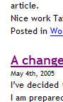
The first step will be to introduce space between posts. Currently we have one long run of text. We’ve already discovered that a post is given a CSS class of ‘post’, so this style is a trivial exercise:
.post {
  margin-bottom: 2.2em;
}
And the result is:
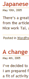
Great. Now let’s add some more basic styles:
.post {
  margin-bottom: 25px;
  color: #4A2C00;
  padding-left: 5px;
  font-size: 1.1em;
}

h2 {
  font-size: 1.6em;
  border-bottom: 1px solid #e8c38b;
}

h2 a:hover, h2 a:visited, h2 a {
  text-decoration: none;
  color: #bd492a;
}

.entry {
  margin-top: 10px;
  margin-bottom: 15px;
}

.postmetadata {
  padding: 2px;
  font-size: 0.8em;
  border-top: 1px solid #FADA96;
}

.postmetadata a {
  color: #4a2c00;
}
There’s nothing complicated here. The margins are changed, along with font sizes and borders. Looking at the effect we are pretty close to complete:
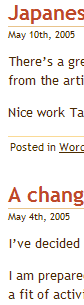
Content style
Although it might not be immediately apparent, the posts in the above image are lacking in content style. That is, the basic content formatting such as spacing between paragraphs and lists.
Let’s tackle the paragraphs first:
.post p {
  line-height: 1.4em;
  margin-bottom: 1em;
}
This makes a big difference to the readability of the blog:
I’ve bundled the rest of the styles together, taking some directly from the existing Kubrick style.css and changing others to suit the current theme.
To demonstrate what is being changed, here is an unstyled test article:
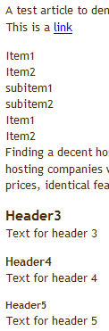
It looks pretty raw. Now let’s define some styles:
blockquote {
  margin: 1em 1.5em;
  padding: 1em 1.5em;
  border: 1px solid #FADA96;
  background: #FCF1E2 url(images/blockquote.png) no-repeat   scroll top left;
}

.post li {
  margin-left: 20px;
}

.post ul {
  list-style-image: url(images/listitem.png);
  list-style-type: bullet;
  margin-bottom: 10px;
}

acronym, abbr, span.caps {
  cursor: help;
}

acronym, abbr {
  border-bottom: 1px dashed #999;
}

blockquote cite {
  margin: 5px 0 0;
  display: block;
}

.center {
  text-align: center;
}

a img {
  border: none;
}

h3 {
  margin-top: 1.5em;
  font-size: 1.4em;
}

h4 {
  margin-top: 1.2em;
  font-size: 1.2em;
}

h5 {
  margin-top: 1em;
  font-size: 1em;
}

.post a {
  color: #bd492a;
}
And the result is:
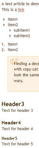
Basically the margins for lists have been re-applied and are identical to those defined in the sidebar (we could re-use the style to reduce CSS size, although I have not done this here). The various levels of headings have been defined so they appear the same size in all browsers, and a background image and colour scheme has been applied to the blockquote element.
Superb, Stunning and Diligent… I was just looking how to design a WordPress theme from my HTML template and this is one tutorial which was just perfect. Thanks for all the painstaking documentation. God Bless!
Thank YOU!
I thought I knew CSS but one look at the Kubrick style.css made wonder whether I really knew it. Anyway, that look was enough to put aside the theme redesign project I had in mind, particularly when I found that whatever changes I make to the stylesheet, the header had the same blue background. It was only when I went through your tutorial that I really was able to identify the problem and go to the Admin panel of wordpress.
Your tutorial provided many more such insights into small details with big impact.
Above all, it provided the confidence to start on the theme redesign project.
Once again, Thank YOU!