Adding a touch of style
Right, so we know what the header is made from, now let’s style it. I will present three variations here, giving some idea of what you can do.
Before we begin it’s worth making a note about font sizes. I mentioned earlier about allowing the user to resize the fonts. We want to provide this ability without the layout deteriorating. This is much more difficult than it seems, and there is a lot of debate on the Internet on how to achieve it. For me the cleanest method is to set the body font size to 76% and then using the ems unit to specify font sizes – an ‘em’ is the size of the letter M, and the everything is specified as ratio of the default (1.2em is 1.2 times the size of the default em).
Let’s put some style back into the body element:
body {
  font-family: 'Trebuchet MS', Arial, Verdana, Sans-Serif;
  font-size: 76%;
}
Here I’ve selected a sans-serif font. Note how it’s important to specify several fonts. These are alternatives if our preferred font doesn’t exist on the viewer’s computer.
Second, let’s turn off those horizontal rules. We can bring them back later if necessary.
hr {
  display: none;
}
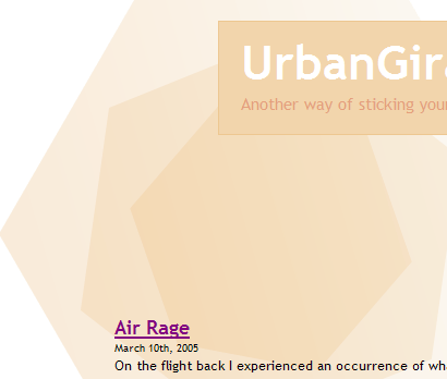
 Option 1 – Basic title, full width, left aligned
Here we have the header section at full screen width, with a small logo.
#header {
  margin-bottom: 20px;
}

#headerimg {
  font-size: 1.2em;
  height: 6.5em;
  color: #FEF4DF;
  padding-left: 7.5%;
  background: #F6C760 URL(images/headerlogo1.png) no-repeat fixed top left;
}

#header a {
  text-decoration: none;
  color: white;
}

#header h1 {
  font-size: 3em;
}
The colours were chosen using the colour selector in an image program (Adobe Photoshop). This supplied them as RGB values, which were then copied into the stylesheet. Most other image programs should have something similar.
What else is going on with the style?
#header
margin-bottom: 20px– provides space between header and content. Space is good
#headerimg
font-size: 1.2em– This is for the blog description text, and we want something a little larger than normalheight: 6.5em– Notice how this is also specified in em units. This ensures that if the font size is increased, the header size will also increase. If we specified a pixel size then the font would eventually overflow the header. Not goodpadding-left: 7.5%– Why 7.5%? Well, our body area is 85%, leaving us with 15%. The theme is centered, so both sides are 7.5% from the edge. Setting 7.5% here puts our title on level with the body and being fluid to move with itbackground–places a simple logo in the corner
So let’s see what effect this gives us:
Internet Explorer

Not bad for a few simple styles!
Option 2 – Basic title, centred
#header {
  margin-top: 20px;
  margin-bottom: 30px;
}

#headerimg {
  font-size: 1.2em;
  margin: 0 auto;
  text-align: center;
  width: 85%;
  height: 6.5em;
  color: #FEF4DF;
  padding-top: 10px;
  padding-bottom: 10px;
  background-color: #F6C760;
}

#header a {
  text-decoration: none;
  color: #CD7042;
}

#header h1 {
  font-size: 3em;
}
This style is similar to the previous, but it is centred on the page (using the auto margin trick). I will excuse myself from explaining things again.
Option 3 – Fancy header
#page {
  background: url(images/headerlogo2.png) no-repeat top left;
}

#header {
  padding-top: 20px;
  margin-bottom: 20px;
  height: 250px;
}

#headerimg {
  font-size: 1.2em;
  text-align: left;
  margin-left: 200px;
  padding: 10px 0px 20px 20px;
  height: 5em;
  color: #E39F7D;
  background-color: #F2D5AC;
  border: 1px solid #EDC791;
}

#header a {
  text-decoration: none;
  color: white;
}

#header h1 {
  font-size: 3em;
}
We try for something a little more unusual here, having a background image that floats underneath part of the content. It also makes use of fixed and fluid sizes, demonstrating that not everything needs to be flexible.
I’ve gone through your tutorial several times. I get everything to work but the footer. For some reason it doesn’t appear to be applying the css from the stylesheet. Can you take a look and point out my error?
I totally dig your work, its been a huge help so far. Thanks.
I am putting up a site and have found your tutorial extemely helpful, but on my site I have this line right below my header and I can’t figure out how to get rid of it for the li8fe of me. Any help would be greatly appreciated.
Hi.
You´r first themguide (part 1) is really good and easy to understand but part 2 of it did not make much changes on my blog unfortunately.
Allthough I followed all the steps you made.
Can it be different if it is WordPress 2.0.5?
My headerimg from the kubriktheme didnt disapear and the margin didnt´n change. The footer did not change either.
In step 3 the apperence of the page did not shrink either.
I would love to learn why.
Thanks.
[…] 「Dissection of a WordPress theme: Part 2ã€ã®è¨³ã€ŒWordPress テーマã®è©³èª¬ï¼šç¬¬äºŒç« ã€ãŒã‚„ã£ã¨çµ‚了。 […]
[…] ã“ã®ã‚¬ã‚¤ãƒ‰ã¯ John Godley ã«ã‚ˆã‚‹ã€ŒDissection of a WordPress theme: Part 2ã€ã®ç¿»è¨³ã§ã€è‘—作権㯠John Godley ãŒä¿æŒã—ã¦ã„ã¾ã™ã€‚ã“ã®ã‚ªãƒªã‚¸ãƒŠãƒ«ãƒšãƒ¼ã‚¸ãŠã‚ˆã³ï¼ã¾ãŸã¯ã“ã®ç¿»è¨³ãƒšãƒ¼ã‚¸ã®è¤‡è£½ã«ã¯åŽŸè‘—者ã«ã‚ˆã‚‹è¨±å¯ãŒå¿…è¦ã§ã™ã€‚- This guide is the translation of the guide UrbanGiraffe » Dissection of a WordPress theme: Part 2 by John Godley who is the owners of the copyright. Any reproduction of the original page and/or the translated page is allowed only with the permission of the author. […]
Internet Explorer is aggravating me. I’ve tried everyway possible to get the sidebar to position correctly within IE, but to no avail. Of course Firefox and Safari both behave normally. I’m not sure what is wrong. I’ve pasted the style information for the content, sidebar and wrapper. Any help would be appreciated.
#wrapper {padding:9px;
padding-top:0;
padding-bottom:10px;
border-left:solid 1px;
border-right:solid 1px;
border-color:#9F9E9E;
margin:0 auto;
width:expression(document.body.clientWidth #wrapper{
width:97.5%;
}
#sidebar {background-image:url(images/content_bg.gif);
background-repeat:repeat-x;
background-color:#C2C2C2;
border:solid 1px;
border-color:#9F9E9E;
margin-bottom:10px;
width:27%;
float:right;
padding-right:10px;
}
#content {background-image:url(images/content_bg.gif);
background-repeat:repeat-x;
background-color:#C2C2C2;
border:solid 1px;
border-color:#9F9E9E;
margin-bottom:10px;
width:69%;
float:left;
padding-left:5px;
padding-right:7px;
text-align:justify;
}
Bryan, all I can suggest is to make the elements smaller and see if it starts working in IE. Sometimes with a percentage width, a fixed padding/margin can confuse IE so it thinks there isnt enough space and pushes elements out of the way.
[…] 2) http://urbangiraffe.com/2005/04/22/themeguide2/Â […]
This guide is what got me on the road to learning CSS. I am no designing websites commercially and fluent in CSS. Thanks for this fantastic resource – it has proved itself to be invaluable to me.
hello!
Thanks for the nice tutorial!
Well, my site is not working completely. I think that I missed a part where to configure the approiate spacing or something in the content, because it is placing the posts not aligned with the header and footer
Also, comment CSS is not working! 🙁
Sorry my english!
PD: http://futuroesplendor.mud.cl/capsulecorp
Elear,
You should give your header element the same width as your page:
#header { width: 700px}It is also likely you will need to remove the left-padding from #headerimg. The same goes for the footer
Thankyou for a great tutorial. Beginning with that and no previous experience of CSS I’ve made the site I wanted. The only problem is when I checked it on IE and find that the sidebar is dropping down below the posts – it displays fine in Firefox.
Can you tell me where I start looking for the problem?
Amanda
I’ve managed to improve it a bit by fiddling with the percentages after reading another here comment on one of the other questions. It’s not perfect because the sidebar doesn’t sit flush right.
Another strange thing is that the colour of the post headings changes half way down the page in IE – not in Firefox. Why would that be given that they’re controlled by the same code? Very odd…
Thanks again
Amanda
Amanda, does this FAQ entry help?
Hi John,
Thanks for this great tutorial. I bought the printable version of it and there are several differences with what’s online ("Fluidity without the breakdown, notably"). Which should I rely on?
Cesco
The printed one is newer. They should both be reliable.
[…] of a WordPress Theme – Part 1, Part 2, Part 3, Part 4 A detailed look at what makes up a WP theme and how to create your […]
[…] of a WordPress Theme – Part 1, Part 2, Part 3, Part […]
[…] 2ä»Žé›¶å¼€å§‹å¼€å‘ WordPress 主题教程 – 第2部分Dissection of a WordPress Theme – Part 1, Part 2, Part 3, Part 4详细介ç»äº† WordPress 主题的构æˆï¼Œä»¥åŠå¦‚何创建 WordPress 主题So […]
[…] of a WordPress Theme – Part 1, Part 2, Part 3, Part […]
[…] older tutorial, but still relevant, this is an in-depth series from Urban Giraffe (See parts 1, 2, 3, and 4) that will take you through the entire process of developing a WordPress theme, with […]
[…] of a WordPress Theme – Part 1, Part 2, Part 3, Part […]
[…] of a WordPress Theme – Part 1, Part 2, Part 3, Part […]
Hi,
This is great learning material you have here, I would first like to thank and congratulate you for it.
I think a found a minor mistake:
In sentence “(…) pointed out yet, header.php defines the div ‘page’ which contains everything, (…)” on page 4, instead of file “hader.php” it should refer to file “index.php”.
Thanks again,
Miguel
Sorry, after reading with more attention I see this is not a mistake.
Ok, so div ‘page’ is defined in header.php file. But now my doubt is, why does the div ‘page’ contains everything, including the div ‘wrapper’, since this is defined in the index.php file in paralle with call for header.php that defined the div ‘page?
Is it because the div ‘page’ is always on top of other user defined containers? Maybe I should get into CSS more thoroughly…
Thanks,
Miguel