Step 1 – Finalising the design
I’ve talked a lot about accessibility and standards conforming philosophies, and this was not to cause mental scarring. In researching this article I realised I needed to undo some changes made in the previous article – it wasn’t wrong, just wasn’t right enough. A bonus is the overlapping problem is neatly fixed.
Customising a theme is largely an exercise in empirical observation. You try different values and tactics until it works, and then you go back and change something that is now broken. Often you need to undo hours of careful work just to introduce a new effect. This may seem like an excuse for not getting it right the first time, but a website requires a lot of trial and error, and that’s before you even get chance to start hacking.
Making it better
Our first task is to return index.php to its original state. We only made one change before, which was to move the get_sidebar function call. The easiest solution here is to copy index.php from the default Kubrick theme again.
Why do we need to do this? Technically it’s not necessary, and I could have skipped this section. However, I decided that if I’m writing a guide I should make sure it gives the best information I know of. The reason we want the content first and the sidebar second is for the accessibility and Google benefits that I described previously. These may be small benefits but it’s worth making the effort.
Now we have restored the index.php file we can continue styling the layout. First we add a content style:
#content {
  width: 70%;
  float: left;
}
The content occupies 70% of the screen, and is floating to the left.
Next we change the sidebar style:
#sidebar {
  width: 28%;
  margin-left: 70%;
}
We have removed the right flotation from the fixed width sidebar and replaced it with a variable width sidebar that is offset 70% from the left left.
What has this achieved? First, re-instating the original index.php means we need to re-arrange which element gets floated. The reason we float anything is that a div is a block-level element. When a browser renders this it adds an automatic line break, putting the next element underneath. By floating the first element (the content) we prevent this happening, and the sidebar can then appear to its right, rather than underneath.
Second, everything is now variable width. Changing the size of the browser changes the size of both the content and the sidebar. I will return to this shortly.
Third we have introduced a left margin for the sidebar. The content in the previous design would overflow the sidebar. Rearranging the content and sidebar means that the sidebar will now overflow. The left margin simply states that the sidebar can never appear any less than 70% from the left of the page. As our content extends 70% from the left, this ensures the sidebar can never overflow.
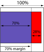
Margin forces sidebar away from content
In simple terms all we have done is change the sidebar and content around. In part one of the guide I had the sidebar first, floating to the right of the content. Now we have the content first, floating to the left of the sidebar. Stylistically it looks the same, but we get several advantages:
- No more overlapping columns
- Better accessibility
- Improved Google awareness
If you choose to have the sidebar on the left you will need to reverse the style – float the content to the right, and put the sidebar margin to the right.
I’ve gone through your tutorial several times. I get everything to work but the footer. For some reason it doesn’t appear to be applying the css from the stylesheet. Can you take a look and point out my error?
I totally dig your work, its been a huge help so far. Thanks.
I am putting up a site and have found your tutorial extemely helpful, but on my site I have this line right below my header and I can’t figure out how to get rid of it for the li8fe of me. Any help would be greatly appreciated.
Hi.
You´r first themguide (part 1) is really good and easy to understand but part 2 of it did not make much changes on my blog unfortunately.
Allthough I followed all the steps you made.
Can it be different if it is WordPress 2.0.5?
My headerimg from the kubriktheme didnt disapear and the margin didnt´n change. The footer did not change either.
In step 3 the apperence of the page did not shrink either.
I would love to learn why.
Thanks.
[…] 「Dissection of a WordPress theme: Part 2ã€ã®è¨³ã€ŒWordPress テーマã®è©³èª¬ï¼šç¬¬äºŒç« ã€ãŒã‚„ã£ã¨çµ‚了。 […]
[…] ã“ã®ã‚¬ã‚¤ãƒ‰ã¯ John Godley ã«ã‚ˆã‚‹ã€ŒDissection of a WordPress theme: Part 2ã€ã®ç¿»è¨³ã§ã€è‘—作権㯠John Godley ãŒä¿æŒã—ã¦ã„ã¾ã™ã€‚ã“ã®ã‚ªãƒªã‚¸ãƒŠãƒ«ãƒšãƒ¼ã‚¸ãŠã‚ˆã³ï¼ã¾ãŸã¯ã“ã®ç¿»è¨³ãƒšãƒ¼ã‚¸ã®è¤‡è£½ã«ã¯åŽŸè‘—者ã«ã‚ˆã‚‹è¨±å¯ãŒå¿…è¦ã§ã™ã€‚- This guide is the translation of the guide UrbanGiraffe » Dissection of a WordPress theme: Part 2 by John Godley who is the owners of the copyright. Any reproduction of the original page and/or the translated page is allowed only with the permission of the author. […]
Internet Explorer is aggravating me. I’ve tried everyway possible to get the sidebar to position correctly within IE, but to no avail. Of course Firefox and Safari both behave normally. I’m not sure what is wrong. I’ve pasted the style information for the content, sidebar and wrapper. Any help would be appreciated.
#wrapper {padding:9px;
padding-top:0;
padding-bottom:10px;
border-left:solid 1px;
border-right:solid 1px;
border-color:#9F9E9E;
margin:0 auto;
width:expression(document.body.clientWidth #wrapper{
width:97.5%;
}
#sidebar {background-image:url(images/content_bg.gif);
background-repeat:repeat-x;
background-color:#C2C2C2;
border:solid 1px;
border-color:#9F9E9E;
margin-bottom:10px;
width:27%;
float:right;
padding-right:10px;
}
#content {background-image:url(images/content_bg.gif);
background-repeat:repeat-x;
background-color:#C2C2C2;
border:solid 1px;
border-color:#9F9E9E;
margin-bottom:10px;
width:69%;
float:left;
padding-left:5px;
padding-right:7px;
text-align:justify;
}
Bryan, all I can suggest is to make the elements smaller and see if it starts working in IE. Sometimes with a percentage width, a fixed padding/margin can confuse IE so it thinks there isnt enough space and pushes elements out of the way.
[…] 2) http://urbangiraffe.com/2005/04/22/themeguide2/Â […]
This guide is what got me on the road to learning CSS. I am no designing websites commercially and fluent in CSS. Thanks for this fantastic resource – it has proved itself to be invaluable to me.
hello!
Thanks for the nice tutorial!
Well, my site is not working completely. I think that I missed a part where to configure the approiate spacing or something in the content, because it is placing the posts not aligned with the header and footer
Also, comment CSS is not working! 🙁
Sorry my english!
PD: http://futuroesplendor.mud.cl/capsulecorp
Elear,
You should give your header element the same width as your page:
#header { width: 700px}It is also likely you will need to remove the left-padding from #headerimg. The same goes for the footer
Thankyou for a great tutorial. Beginning with that and no previous experience of CSS I’ve made the site I wanted. The only problem is when I checked it on IE and find that the sidebar is dropping down below the posts – it displays fine in Firefox.
Can you tell me where I start looking for the problem?
Amanda
I’ve managed to improve it a bit by fiddling with the percentages after reading another here comment on one of the other questions. It’s not perfect because the sidebar doesn’t sit flush right.
Another strange thing is that the colour of the post headings changes half way down the page in IE – not in Firefox. Why would that be given that they’re controlled by the same code? Very odd…
Thanks again
Amanda
Amanda, does this FAQ entry help?
Hi John,
Thanks for this great tutorial. I bought the printable version of it and there are several differences with what’s online ("Fluidity without the breakdown, notably"). Which should I rely on?
Cesco
The printed one is newer. They should both be reliable.
[…] of a WordPress Theme – Part 1, Part 2, Part 3, Part 4 A detailed look at what makes up a WP theme and how to create your […]
[…] of a WordPress Theme – Part 1, Part 2, Part 3, Part […]
[…] 2ä»Žé›¶å¼€å§‹å¼€å‘ WordPress 主题教程 – 第2部分Dissection of a WordPress Theme – Part 1, Part 2, Part 3, Part 4详细介ç»äº† WordPress 主题的构æˆï¼Œä»¥åŠå¦‚何创建 WordPress 主题So […]
[…] of a WordPress Theme – Part 1, Part 2, Part 3, Part […]
[…] older tutorial, but still relevant, this is an in-depth series from Urban Giraffe (See parts 1, 2, 3, and 4) that will take you through the entire process of developing a WordPress theme, with […]
[…] of a WordPress Theme – Part 1, Part 2, Part 3, Part […]
[…] of a WordPress Theme – Part 1, Part 2, Part 3, Part […]
Hi,
This is great learning material you have here, I would first like to thank and congratulate you for it.
I think a found a minor mistake:
In sentence “(…) pointed out yet, header.php defines the div ‘page’ which contains everything, (…)” on page 4, instead of file “hader.php” it should refer to file “index.php”.
Thanks again,
Miguel
Sorry, after reading with more attention I see this is not a mistake.
Ok, so div ‘page’ is defined in header.php file. But now my doubt is, why does the div ‘page’ contains everything, including the div ‘wrapper’, since this is defined in the index.php file in paralle with call for header.php that defined the div ‘page?
Is it because the div ‘page’ is always on top of other user defined containers? Maybe I should get into CSS more thoroughly…
Thanks,
Miguel