Choosing a design
Before we loose sight of the website in this increasing jumble of code, lets do something practical. Currently our website has a title at the top, a middle section for posts, the sidebar underneath, and a footer. By removing the styles we have automatically gained a variable-width design. Now we should arrange the sections into a design of our choosing. For this guide Ive gone for a standard two-column layout:
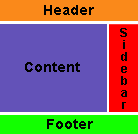
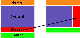
In translating this design onto the screen, the most obvious step is to move the sidebar into position on the right.
The sidebar
The sidebar is contained within the file sidebar.php. If we take a look here we find a lot of code, and we can ignore all but this summary:
<div id="sidebar">
  … sidebar code …
</div>
Everything is cleanly wrapped inside an HTML div section with an ID of sidebar. This is just what we need, as it means we can change the appearance of the sidebar by simply adding appropriate styles in the CSS file, and without touching a single line of code in sidebar.php.
So, edit style.css and add the following style after the header:
#sidebar {
  float: right;
  width: 190px;
}
I’ve split this into three sections:
#sidebar– This tells the browser the style is for an element with an ID of sidebar (.sidebarwould indicate a class of sidebar).float: right– This floats the sidebar on the right side of the screen. You can equally use left if you want your sidebar to be on the left.width: 190px– Although we have a variable-width design, we don’t want the size of the sidebar to change. This fixes it at 190 pixels (change to your own preference).
Awesome resource! Just invaluable! Thanks so much for sharing it!
Not sure if anybody else had to do this, but to clear the style completely, I had to remove the at the end of the header.php file otherwise you would get rendered borders. this happened in safari 4.0.1 and firefox… whatever version I have installed. I don’t know, I never use it.
putting it back in, the break comes back but without the strange borders on either side. Don’t know why it was happening in the first place. Thanks a bunch for such a great tutorial.
Hi jonh,
i tried to do part 1 but if i notice a fault that i’m gonna to talking about.
In Italian version of this guide at the bottom of each page , there is your two MonkeyMoney : one with style and other without.
So i uploaded your themes and i turn one with no-style, i clear style.css leaving only “header” you suggest to add to style.css( not style at all… ), and i copy header of theme from these page where i’m posting and i add it to MonkeyMoney witout style.
So, even i clear-up every style from header.php, if i mantein header.php in the theme, layout is not the same displayed here : stage1finalthumb.png; but eliminating header.php layout is displayd in a right way…
In my opinion this is not explain clearly.
Regards
Not sure if anybody else had to do this, but to clear the style completely, I had to remove the at the end of the header.php file otherwise you would get rendered borders. this happened in safari 4.0.1 and firefox… whatever version I have installed. I don’t know, I never use it.
this is the most straight forward and clearest guide word wordpress beginners i’ve so far seen. thanks.
this is a great help thanks! I’m using Lubith to generate my themes which is a lot easier and faster than starting from scratch but I will use this information to manipulate the code behind and get the best results. thanks again